
CLIENT:
CYP
Services:
LOGO Design
ReBRand Identity
Agency: Qonkur Media
YEAR: 2022
My Role: Art Director; Graphic Designer
Collaborators:
August Familiant - Account Manager
Software Used: Illustrator
Photoshop
Indesign
CYP is helping people live happier, healthier lives through wellness and innovation. As a cannabis brand on a pharmaceutical-grade level, CYP is here to be of service and deliver value to consumers.
____________________________________________
Problem: CYP (Choose Your Protocol) looked more like a prescription than a wellness brand. The pharmaceutical-style packaging and technical language felt intimidating, turning off everyday consumers and making its wellness mission hard to sell.
Solution: I led a rebrand that kept CYP’s pharmaceutical-grade credibility and emphasized its nano-emulsion innovation while shifting the identity into a warmer, more human system. Now "Choose Your Protocol" feels approachable and easy to understand.
Outcomes: Clearer on-shelf story that positions CYP as a wellness-first alternative to opioids and benzodiazepines, not a clinical prescription product; Packaging and messaging that feel inviting for older, health-conscious consumers who want fast-acting edibles without smoking; A cohesive brand system that supports a premium, science-backed positioning while still feeling friendly and everyday-usable.
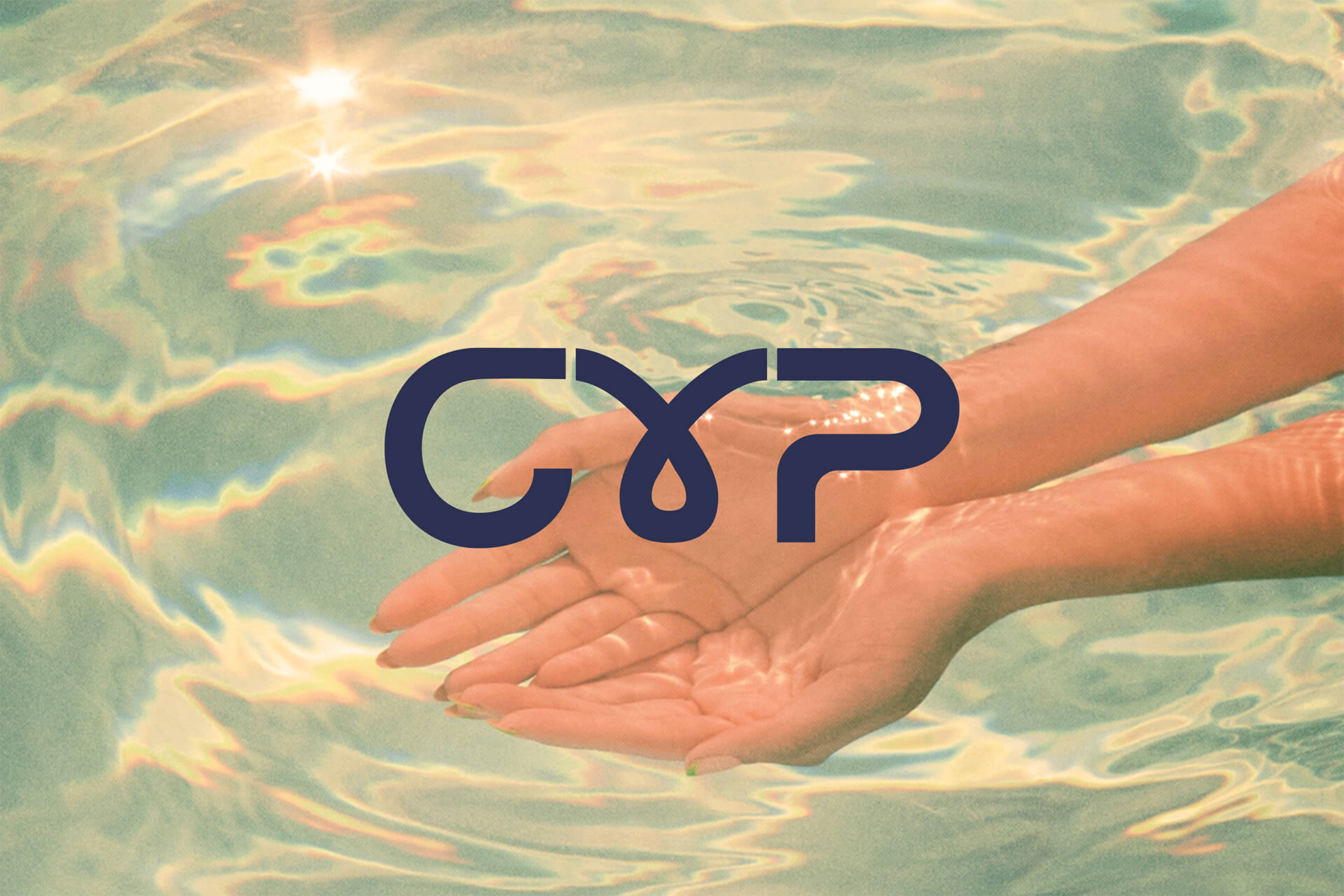
Logo Evolution
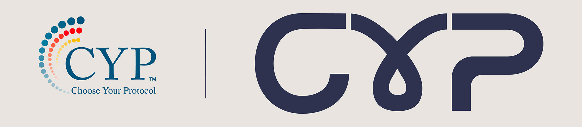
Side by side, the new CYP wordmark (right) turns a clinical logo into a more approachable symbol of choice, with the droplet in the 'Y' cueing nano-emulsion powders made to mix into everyday routines.
LOGO OPTIONS
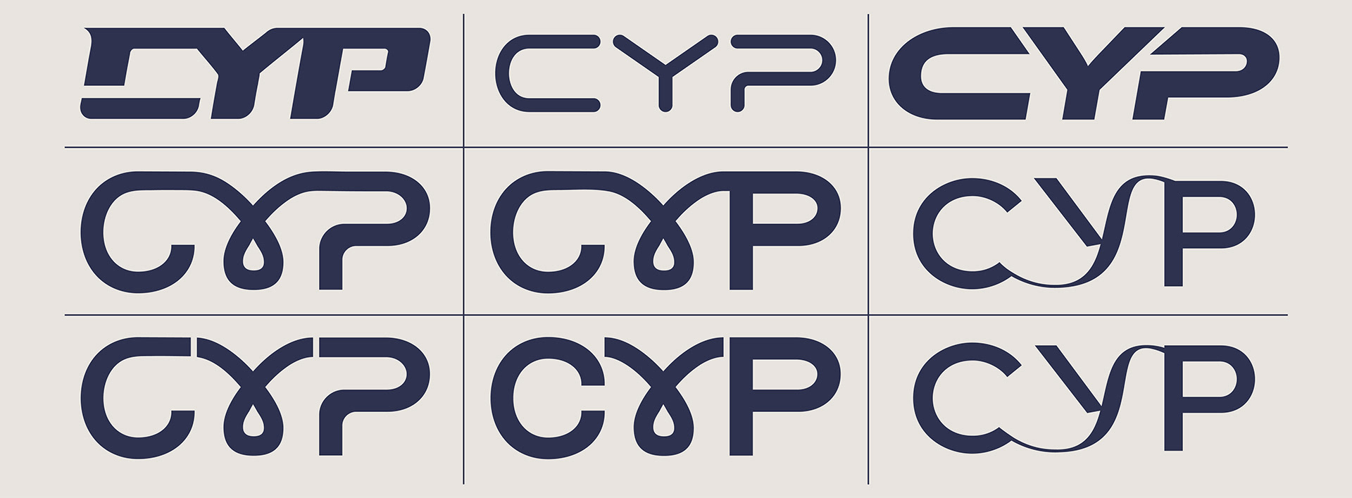
Logo options explore different typefaces as well as how the C and P connect, separate, and balance with the droplet to land on the clearest, most confident expression of CYP.
Color Story
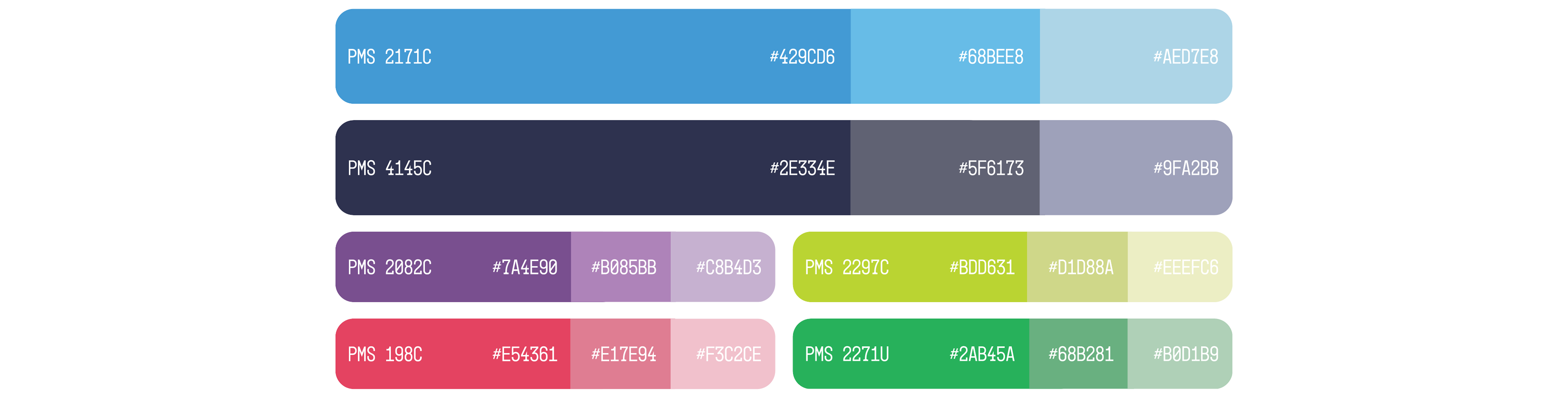
The CYP palette is built to look like wellness and feel easy to live with. Trustworthy blues and soft accents help the brand stand out from clinical competitors, support a wellness-first story, and make protocols feel simple to add into everyday routines.
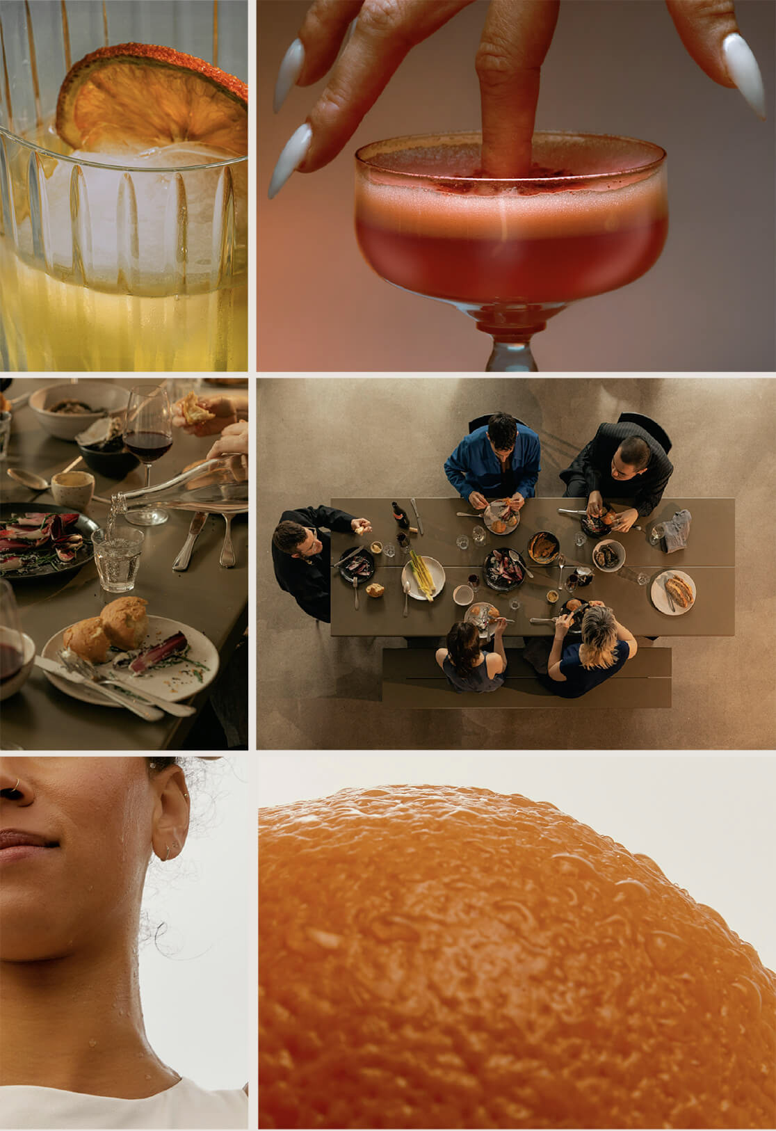
Photography Rules - Look & Feel
Photo Rules:
Use warm, natural light so scenes feel lived‑in and human, never clinical or harsh.
Use cropping and close‑ups that highlight texture in drinks, citrus, and other key details.
Use a subtle 70s‑style film grain and color shifts in post to keep the work feeling nostalgic rather than hyper‑digital.
Focus on ritual and product pairing: pouring, stirring, sipping, and mixing CYP into real drinks and everyday routines.
Keep people candid and relaxed; if they are posed, they should still feel natural, mid‑moment, and not overly styled.
Make product the hero in every frame, clearly readable but integrated into the scene instead of floating like a clinical pack shot.
Why this works:
This photography system makes CYP read as wellness rather than pharma or “party” cannabis. Warm, ritual‑focused images help older, health‑conscious consumers see protocols as easy to mix into daily life, build trust for a science‑backed product, and support the premium price point without ever feeling cold or intimidating.
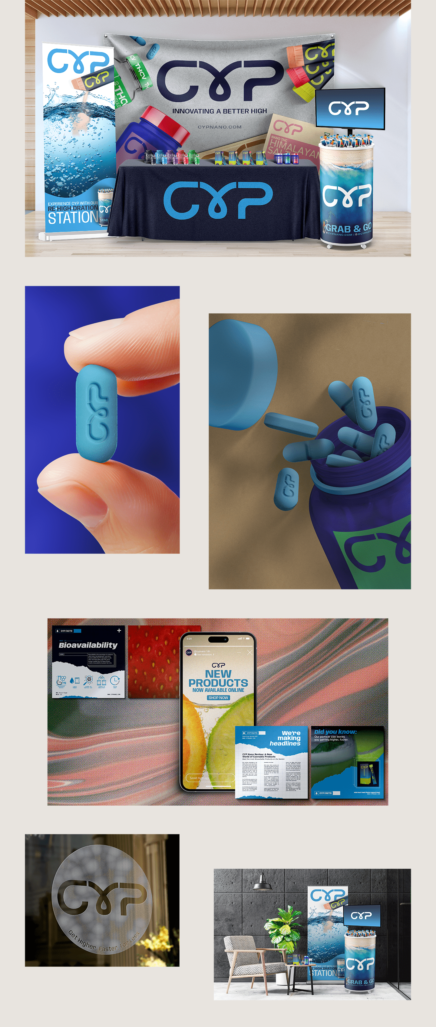
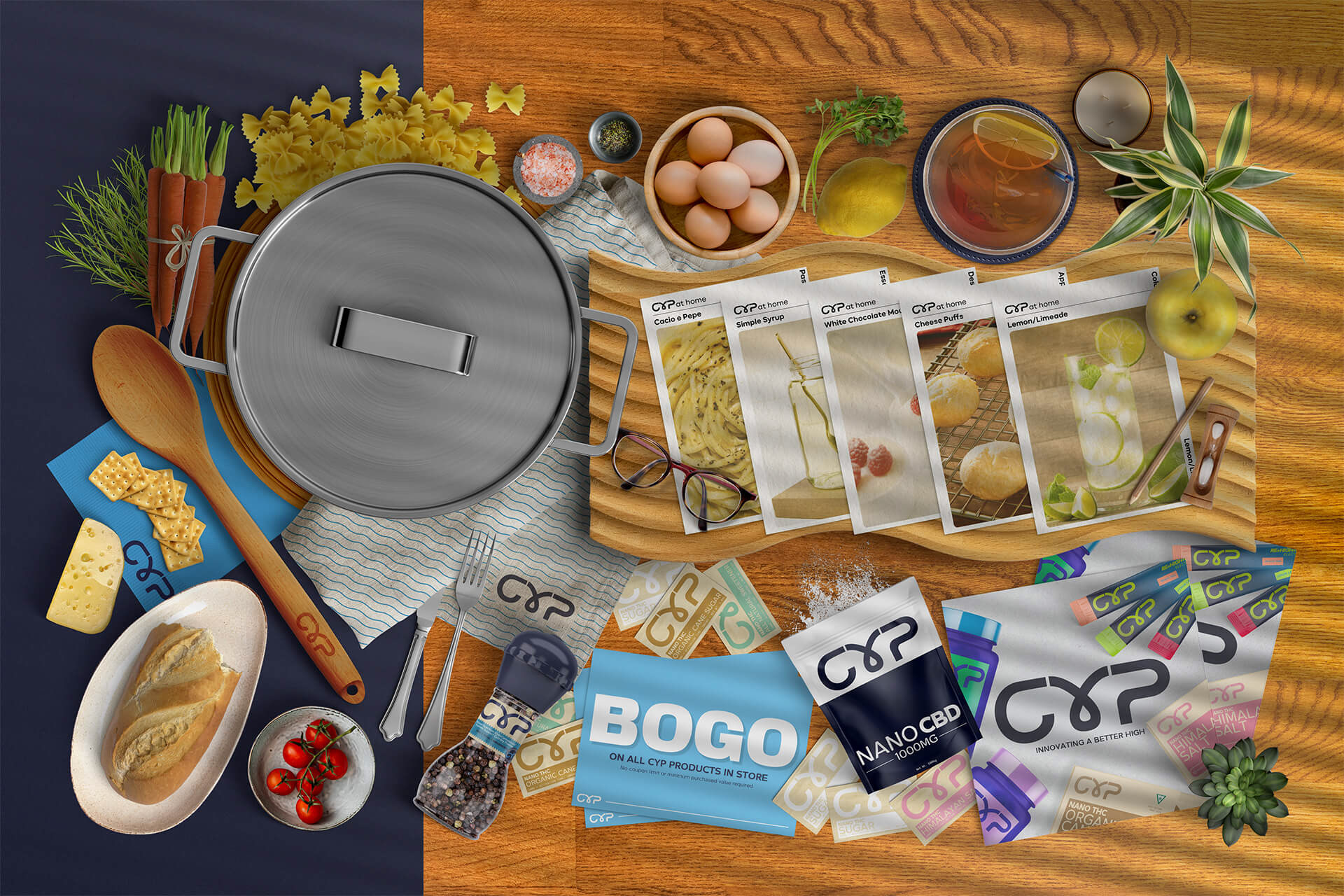
Brand Mockups